Logo
The Headland Yachting logo, and how to use it so it always looks right.
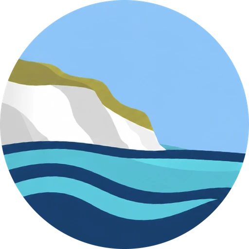
Versions
Use the full-colour logo wherever you can. On photographs or busy backgrounds, use the white version on a dark area of the image, or put the logo on a plain panel.
Space around it
Leave clear space on every side at least as big as the height of the logo’s capital letters. Nothing else (text, edges, other logos) goes inside that space.
Smallest size
Don’t use the logo smaller than 24 pixels high on screen or 8 mm high in print. Below that, use the icon on its own.
Don’t
- Stretch, squash or rotate it.
- Recolour it outside the brand colours, or add shadows or outlines.
- Put it on a background where it’s hard to read.
- Rebuild it from a font: always use the supplied files (see Downloads on the overview).